


The use of graphs in the appraisal process
Canadian Property Valuation Magazine
Search the Library Online


By George Canning, AACI, P. App., Canning Consultants Inc., London ON
Introduction
Real estate practitioners are using more visual aids than ever before to describe data in their appraisal and consulting reports. Graphical knowledge is key in terms of using them properly.
There are many statistical programs in the marketplace that can produce a wide variety of graphs, including sophisticated data analysis – SPSS, Mini Tab and ‘R,’ to name a few. Some of these programs, such as ‘R,’ are free. All statistical programs require some background knowledge about statistics. Two award-winning books on the subject are Head First: Data Analysis and Statistics by Michael Milton and Dawn Griffiths.
Graphs are very good at discerning patterns in real estate data, but many times only on the surface. More often, the real message of the data is buried deep within it. Since real estate appraising and consulting IS about DATA ANALYSIS, the advice to any valuation practitioner is to start the data learning process now. The tools are available at relatively low costs. All that is needed is the desire to start exploring your data.
Organizing your data
Before addressing the subject of graphs, there is a need to review real estate data and how to organize it. Data is not perfect in that it does not present itself in some format for any real estate professional to follow and understand. The first step is to put the data in a spreadsheet. It does not matter if there are five sales or 500 sales, the process is always the same. It is all part of what is known as ‘cleaning your data.’ Appraisers collect sale after sale throughout the years on a wide variety of property types. They are all kept in books or on some type of a word processing sheet. For the most part, the data becomes redundant the minute the appraisal report is sent to the client. Unless this data is converted to a spreadsheet, its graphical and statistical benefits cannot be unlocked.
A good place to start is organizing the data by Sale Number, Sale Date, Sale Price, Address, Selling Price (per some unit of measure), Age of Building, Lot Size, Zoning, Lot Frontage, Cap Rate and GIM Rate, which are the most common names of property attributes. There are no rules except to record the basic information about each sale.
Sales data can largely be expressed two ways: quantitatively and qualitatively, which have two distinctly different meanings. Quantitative data is what it implies – the size of a building or lot. Qualitative data would be a grade of building condition or location. Qualitative data can be easily expressed by using a nominal scale such as 1 = Fair, 3 = Average, and 5 = Good. Or, a dummy or discrete variable can be used such as Flood Plain Designation = 1, No Flood Plain Designation = 0. The reason for converting qualitative data into a number or score is because computers can only process a number or a number that is assigned to some condition or type. Converting the data to a number does not take away the importance of the variable, it simply categorizes it. A score of 1 is not 2 times less than a score of 3. It is all about membership.
Data that is quantifiable is more relevant than data that is qualifiable because it is a specific number. Using the word Fair or Good tends to be subjective because each real estate expert can have a difference of opinion as to what Fair or Good means. Yes, scores can be allocated to these words for computer processing, but they are not as specific as a given number. However, a system is needed to measure those data variables that are not absolute.
The average price of the data is often referenced in appraisal documents. However, the average of anything has little meaning, since one does not know the dispersion around the average. The measurement that speaks to that is Standard Deviation, which is known as the ‘distance from the mean.’ The smaller the Standard Deviation number, the smaller the distance centred from the mean. Expressing Central Tendency using a Mode (i.e., the most frequent number in the data set) or Median (i.e., the number in the middle of the data set) can help with the differences around the mean, but they are of limited value.
Boxplots are helpful when examining means between groups of data. Graph 1 is a Boxplot on three different types of industrial building exteriors. Exterior 1 are those buildings that have an exterior of only enamel steel cladding; Exterior 2 is a mixture of masonry and enamel steel clad finishing; and Exterior 3 is all masonry. Graph 1 is an expression of the three different types of exterior finishing using Boxplots.
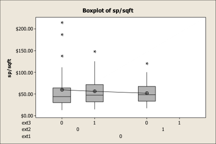
The centre Boxplot of a mixed exterior use has a mean price of $60.00. The Boxplot on the left is all masonry and its average price is $62.50. The remaining Boxplot of enamel cladding is $53.00. The conclusion using Boxplots is that those buildings having a masonry/masonry-steel cladding trade about $8.25 higher than those buildings with all steel siding.
This is a good example of some of the problems with only using the means of numbers. The statement cannot be made that the $8.25 amount is a reliable number because the statistical role of other variables within the data set is not known. Within this article, we will return to this topic to see if the $8.25 has any validity.
Boxplots can tell us a lot about distribution. The horizontal line is the median price of the data, while the symbol that is connected to a line is the mean. When the mean is above the median line, it is said that the data is ‘skewed’ to the right. The bottom horizontal line is known as Q1 and is the middle value of the first half of the list of data, while Q3 is the middle number for the second half of the data. The whiskers represent the general width of the data, with the stars being outliers or beyond the normal range of the data.
To reiterate the point about graphs, what appears as a trend on the visual aspect of the data may not necessarily be what is occurring underneath the data set. That is because most graphs only view two variables and there could be other variables that play a role in explaining price. Sometimes, data needs to be transformed to a Log format. The reason is that a given variable may take on a more uniform pattern by switching the data from quarts to litres, or litres to pints, for example. The data is not being altered, it is being expressed in a different format.
Scatterplots
Scatterplots are simply the placement of data measured by two points. They are very useful because they can quickly visualize trends. Sometimes, the trend it not obvious. If not, try turning the graph on its side to see if a trend emerges from that perspective? Scatterplots are based upon inputs on the ‘X’ and ‘Y’ planes.
Graph 2
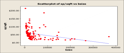
Graph 2 is a Scatterplot between industrial building size and the selling price per square foot of building. The economies of scale are taking place, whereby the larger the building, the lower the selling price per square foot of building. This is excellent information to know in the adjustment process of the DCA. However, caution is the order of the day. This graph cannot be used as a proxy for value.
Graph 3 is the same Scatterplot being used to value a 100,000 square foot industrial building. A line is drawn upward from the ‘X’ plane (100,000 square feet) until it crosses the simple regression line (blue). Then, that intersection is extended to the left until it crosses the ‘Y’ access (selling price per square foot of building). By this illustration, the $100,000 square foot building would be worth $49.00 per square foot.
Graph 3
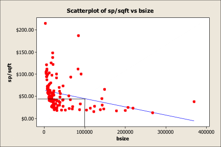
The problem is that building size only represents one variable. There are other potential variables that could be influencing the selling prices per square foot of building. Also, there is a need to contend with outliers, which can have an influence on the simple blue regression line by pulling either positively or negatively on the general ‘cloud’ of data. By simply removing the outliers, it changes the value of the 100,000 square foot building as shown in Graph 4. Now, the 100,000 square foot building is only worth $40 per square foot.
Graph 4

The moral of the story is not to use Scatterplots to determine value. Use them as visual aids to alert the reader to data patterns. To use the data for valuation purposes, a proper Regression Model needs to be built.
Histograms
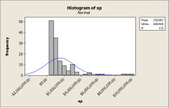
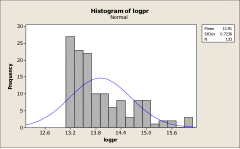
Histograms are counts that have been placed in a common bin. They are very useful, particularly if a fit line is added to ascertain the data’s shape. Graphs 5 and 6 represent a Histogram of selling prices. Graph 5 is the data as it appears in its raw state. This data is spread out far to the right. However, after transforming the data (Graph 6), the data is more uniform and fits the Normal Curve more easily. The transformation was to a Log format.
Graph 5
Graph 6
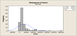
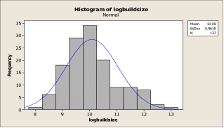
Graph 7 is a Histogram of industrial building sizes. What do you see? Skewed to the right. After transformation to a Log, the building sizes take on a very close shape to the Normal Curve, as indicated in Graph 8.
Graph 7
Graph 8
The advantages of transforming the data is within the use of an MRA, since the intention is to fit the data to a linear model and remove the skewedness out of the data. The closer to the Normal Curve the data can be shaped, the better the results will be with the regression model. The Normal Curve was first conceived in the 18th Century by Abraham De Moivre, a statistician and an advisor to gamblers. The Normal Curve or Gaussian Curve has amazing properties of prediction and is thus a big benefit for dice and card players.
Bar Graphs
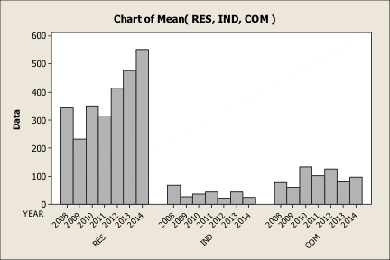
Bar Graphs are graphs of bars that can be vertical or horizontal. The Bar Graph is a fast and effective way to see patterns in data. Graph 9 is a Bar Graph of the dollar value of building permits of the three most important building categories (i.e., residential, industrial and commercial).
At first glance, one sees a robust marketplace of residential development, the very low dollar value of building permits issued for industrial, and a stronger commercial and retailing sector.
However, the real value in the graph is shown with the blue arrows. Notice the effect of 2008 (i.e., the world banking market collapse) in all three building categories. That is a power piece of information if one is completing a retrospective value in 2009 of some property. It is interesting to note that this trend in 2009 was noticed throughout much of Ontario, with the exception of the GTA (Greater Toronto Area).
Graph 9
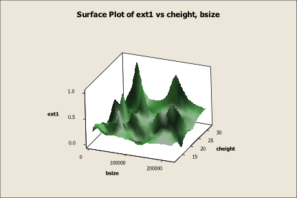
Surface Plots
Surface Plots are sophisticated types of graphs that could be useful when considering relationships between different variables. Surface Plots require that one variable has to be categorical and the other two numeric.
Graph 10 is a Surface Plot of industrial building exterior against building size and ceiling height. It can show relationships that are shaded with each of the variables.
Graph 10
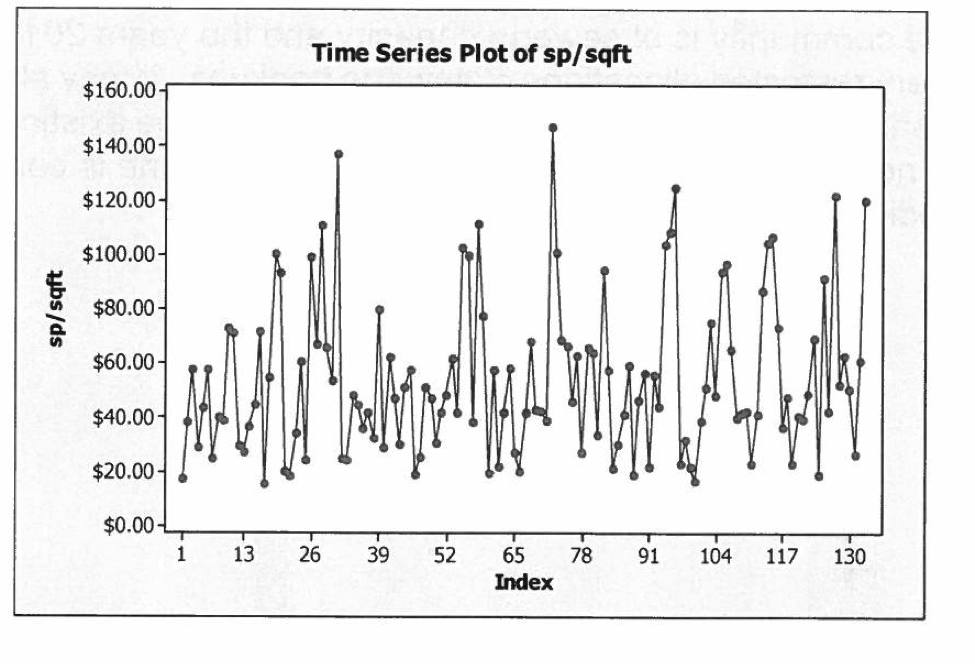
Time Series Plots
A Time Series Plot like the one shown in Graph 11 is of the selling prices per square foot of a building from 2005 to 2014 in a given city. The Index 1-130 is not of actual years, but of the overall time period. For example, 1-13 could be the timeframe from the start of the data to say June 1, 2005 to April 17, 2006, when it changes into a different time period.
Time Series are interesting ways to demonstrate the volatility of a specific data type. By examining Graph 11, what type of pattern is evident through the peaks and valleys of the data? The answer is that there are periods of increasing prices against times when the industrial marketplace went ‘soft.’ These up and down trends do not just reflect time, but also other variables such as lot size, building size and a host of other attributes that could play a role in explaining changes in price levels. This gets sorted out by an MRA (Multiple Regression Analysis).
Graph 11
Reporting trends with graphs
Graphs used in reports are of no value unless they are discussed in some detail regarding what they might reveal about the data. Readers of reports are not mentalists and they lean on the appraiser to provide insight into market behaviour. Graphs should not be included in any report to make things look pretty, they should be there to inform. If a graph is indicating a flat marketplace, then that should be drawn to the attention of the client, who may be just about to start negotiations with the buyer.
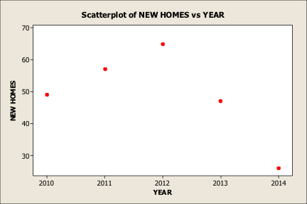
Graph 12 is a Scatterplot of the number of new homes constructed in a small community. The graph depicts a downward trend in new housing construction. However, the graph could also be a statement of the fact that there is limited sewage capacity going into 2013 and 2014. It could address the pent up demand for housing, if and when the municipality adds another cell to its treatment facility – a good piece of information if an appraisal is being completed on subdivision land in that area.
Graph 12
When graphs do not tell the entire story about the data
Graphs generally represent two-dimensional space and are a reflection of one variable against some other, such as the selling price per square foot of housing. Graphs can be informative when taken under face value for such aspects as building permit values, unemployment rates, and the amount of commercial space being absorbed in a given community. Here, the graphical information is point blank and absolute.
Where graphical information cannot be trusted is when two variables are used to predict a value. The problem lies in the fact that real estate is generally impacted by a number of aspects/property characteristics/variables. These variables may even interact with one another. So, how does one know which variable is important in the appraisal process in explaining prices in a given data set? The only way to know for sure is to run a regression model through some statistical program.
Earlier in the article, the usefulness of a Boxplot was demonstrated and this graph suggested that there was a difference in the selling prices of those industrial buildings with a masonry finish and those with an enamel steel clad finish.
Below is an MRA output of industrial properties in London, Ontario. It is not necessary to explain all the results except for Exterior 2 and Exterior 3. The results of these variables are emphasized for a better illustration.
Predictor Coef SE Coef T P
Constant 5.361 3.108 1.72 0.088
LotS Log 0.31513 0.06970 4.52 0.000
logbage -0.36141 0.05084 -7.11 0.000
logcheight 0.2504 0.1688 1.48 0.141
logdmroad -0.03883 0.02786 -1.39 0.166
log401 -0.17265 0.04883 -3.54 0.001
logumrate -0.1422 0.2151 -0.66 0.510
logcdndol 0.0451 0.4986 0.09 0.928
logbuildsize 0.39254 0.06765 5.80 0.000
date 0.00014153 0.00003519 4.02 0.000
loc -0.02633 0.04222 -0.62 0.534
fplain -0.13077 0.09540 -1.37 0.173
zone -0.05566 0.04453 -1.25 0.214
eland -0.03115 0.07745 -0.40 0.688
ext3 0.05703 0.08798 0.65 0.518
ext2 -0.03458 0.09056 -0.38 0.703
S = 0.334323 R-Sq = 84.1% R-Sq(adj) = 81.7%
First, what happened to Exterior 1? Nothing has happened to it except that this variable has been defaulted under the Minitab program as a comparison to the other two. The far right numbers represent the P values or probabilities of whether or not the numbers or coefficients 0.05703 and -0.03458 were determined by random chance or they represent an association with the sale prices of the comparables. Since these P values are very high, they cannot be relied upon as being beneficial in explaining the differences in the prices of the industrial building sales that had different types of finishing. The second column is the Standard Error. These numbers are larger than the coefficients, which is also an indicator that the coefficients cannot be relied upon as good indicators of explaining prices as a result of the different finishes.
In the end, the Boxplot indicated a price differential, but only based upon the mean selling prices of each category of industrial building type. When all the variables were considered in explaining price, it was found that Ext 2-3 were not significant. That does not mean that Ext 1-3 should never be excluded from future regression runs with more data added. The best that can be said with this data set is that no evidence was seen that Ext 1-3 reflected on the selling prices of the data. That could be because the general industrial marketplace was depressed and buyers were not paying the difference in exterior finishing at that time. We simply do not know.
Conclusion
Real estate valuers who want to use a graph in a report should accept the responsibility of ‘duty of care’ regarding them from various perspectives:
- Does the graph overall contribute to the appraisal process?
- Is the right type of graph used?
- Was there a good explanation to the reader about the graphed data?
- Is the source of the graphed data reliable?
American economist Emily Oster said it best: “The greatest moments are those when you see the results pop up in a graph or in your statistics analysis – that moment you realize you know something no one else does and you get the pleasure of thinking about how to tell them.”
Bibliography
Stephen Few: Show Me the Numbers: Designing Tables and Graphs to Enlighten
Edward Tuffe: The Visual Display of Quantitative Information
Namomi B. Robbins: Create More Effective Graphs