

Using Simple Regression Analysis – A Strong Case for Taking That Stats Course
Canadian Property Valuation Magazine
Search the Library Online


Several years ago, I was asked to value a lakefront, residential lot. I gathered all of the lakefront sales from the previous 3 years and a few current listings. During the course of investigating the sales, a Realtor commented about the typical prices per front foot for lakefront lots in our area. This was the second time in a year that I had heard a market participant use price/front foot for lake front lots. I was going to render my sales data into price/acre and I started to wonder if I was going about this wrong.
I had been using spreadsheets ever since I moved from residential forms to narrative appraisals. They were effective for keeping track of adjustments, and as long as there were no errors in my formulas, they were accurate and much faster than simple text tables and calculators. So I decided to rank the sale data first by ascending lot area, then by ascending front footage. If I first adjusted all data for the usual criteria of time and then for locational and physical differences between the data and the subject (topography, access, services, beach quality etc), I could calculate the adjusted price/front foot and the adjusted price/acre and see if there were patterns. Maybe price/front foot was the most appropriate way to measure and compare lake front lot values. In my tables, it looked like some kind of pattern was emerging for one of the units of comparison, but visualizing the form of the pattern by staring at the numbers was difficult.
Table 1 – Ascending Lot Size
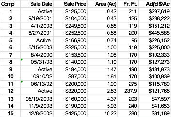
Table 2 – Ascending Lot Frontage
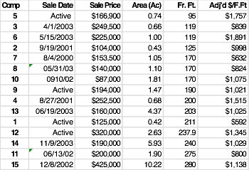
(For presentation, the addresses and adjustments in these tables have been hidden)
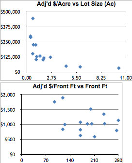
I knew that I should be able to graph these sale data somehow, to show adjusted price/front foot vs. front footage and adjusted price/acre vs. lot size. After some experimenting, I was able to produce basic scatter plots. Immediately, the differences between the two charts were obvious and very revealing. One scatter plot gave a relatively uniform pattern in the shape of curve. The other pattern looked random. Visually, it became apparent that the adjusted price/acre comparison was likely far more meaningful.
That answered the question of what unit of measurement I should use, but here’s where the analysis got interesting. After creating the scatter plot, I was trying to format it. If you right click on a data point in a scatter plot in Excel, the “add trendline” command appears. Interesting, I thought; a line that shows a trend – this could be useful. That was an understatement. 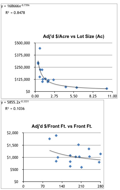
Adding a trendline is done by some pretty hefty, behind the scenes computing. Excel (and other spreadsheet and statistical software) mathematically fits the trendline to the data to best fit its dispersion. You can see that the trendline on the left fits the data much better than the one on the right. Another name for this trendline is a regression line and this process, it turns out, is one of the many forms of regression analysis.
Regression analysis is a powerful statistical tool that is widely used in the sciences for prediction and forecasting. It can tell you if there is or isn’t a correlation between two (or more) variables. With real estate analysis, we are always asking how certain characteristics – building size, floor location in a high rise, quality and condition ranking, lot size, time – affect price or value. In this case, it enabled me to determine that lot size had a great effect on price, but just as importantly, that front footage variation did not. Clearly there was very good correlation in the first comparison and limited correlation in the second. (The R² – the coefficient of determination – measures how much of the variability in the adjusted price/acre and price/front foot is explained by the regression line. In the first chart, 85% of the variability in price is explained by size, in the second, only 10% is explained by lot frontage.)
Taking it a step further, if you remember your high school algebra, these lines and curves are mathematically defined by an equation (Excel can calculate and display the equation, as shown above). Using the equation of the line/curve allows you to input an x value (lot size in this case) to find the y value (price/acre). This equation can be used to great effect in your analysis. In first chart, the equation of the curve is shown as:
y = 168,666 x -0.736
By inputting subject lot area (x), the regression equation can be solved for price/acre (y). For example, let’s say that the subject is 2.5 acres. Solving for y is done as follow:
if x (subject lot size) = 2.5 acres, then
y (subject price/acre) = 168,666 (2.5) -0.736 or,
y = $85,930/acre
The resulting estimate of market value therefore is $215,000 ($85,930 x 2.5 acres, rounded). Using the same equation, a subject area of 2.0 acres, results in a value estimate of $205,000 and a 5.0 acre lot has a market value of $260,000.
Regression analysis can answer difficult questions with far more certainty than traditional valuation reconciliations that just favour one or two comparables from a table of sales. It allows a wider set of data to meaningfully influence your analysis. It can be used value vacant and improved properties in the direct comparison approach when you’ve got good data across a wide range of size (typical in small or specialty markets). It can effectively differentiate lot values in a potential subdivision when there is lot size variation in the proposed layout (which is usually the case). It can estimate the added value of a building expansion or evaluate the division of a building into various rental size scenarios. It can estimate the before and after effects of partial takings. It can expose outliers or errors in data and send you back for further investigation. It can reveal patterns in data and it can show you what is just noise.
I believe so strongly in the power of regression analysis as a fundamental valuation tool that I wanted to write about this topic for an earlier Canadian Property Valuation issue. But as I was writing, I quickly realized I was not (and still am not) an expert and had far too many questions of my own. So I shelved the article and looked to the AIC’s educational offerings to see if I could find a course that would give me some formal instruction. I enrolled in UBC’s BUSI 344 – Statistical and Computer Applications in Valuation – one of the core courses in the current AACI program.
I am most of the way through this course now and have to say that it has been far more interesting and illuminating than I could have ever anticipated. The course content is easy to relate to as it includes typical real estate analysis problems and situations that many of us face on a daily basis. It not only introduced incredibly useful tools and methods, but repeatedly emphasized the potential pitfalls and dangers of applying rote formulae to the study of the marketplace. It reconfirmed the adage that real estate valuation is both science and art.
If you are working in the field of real estate appraisal and you wish to have a deeper understanding of the use and interpretation data, you owe it to yourself to take this course. If you want to advance your ability to discover and reveal the meaning of your market to your clientele, you owe it to them.